
Showing Off Results: How to Generate the Right Marketing KPI Reports

Every experienced marketer will tell you that data-driven marketing involves a slew of software solutions that offer advanced analytics designed to both automate and optimize processes. Thankfully, Martech (marketing technology) has come a long way in the past 10 years. Marketing teams are in a much better place to optimize strategies, reach their key performance indicator (KPI) targets, and showcase marketing efforts. However, when it comes time to showing off the results your marketing programs have been getting, all the software in the world won’t help if you can’t extract and interpret the data. There needs to be some degree of data literacy involved, after all, without a fundamental understanding of data, it's difficult to increase conversion rate.
Your social media, PR, and digital marketing teams undoubtedly need to pull and deliver progress reports for the higher-ups. You may have a data geek to manage the process or your team may need to learn to do it themselves. Either way, if you’d like your KPI reporting to have a standardized look-and-feel, regardless of which combination of marketing tools you use, a business intelligence (BI) tool can ease the pain (especially when the alternative is Excel!).
Analytic software solutions like Microsoft Power BI, Tableau, Meltwater, and Sisense allows users to easily create charts, graphs, and other data visualizations to help present their marketing efforts. Each product has its own learning curve, some worse than others, but for the purpose of this article, we've decided to present examples from Tableau and Meltwater. So, without further ado, let’s take a look at what reports might look like for key KPIs:
MARKETING KPI: TIME ON PAGE
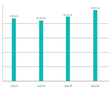
This graph shows the average time spent on a website landing page for over a given period of time. Each bar represents a week, and the time is shown in standard hh:mm:ss format. For marketing teams looking to implement 'time on page' as a metric, the idea is to improve the amount of time people spend on your landing page and decrease your website's bounce rate. If your marketing campaign has successfully triggered interest and engaged your audience, you should naturally see the time spent on page increase as a result.
MARKETING KPI: SHARE OF VOICE
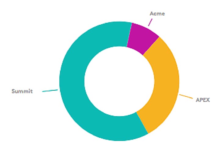
Like most data sets with a total, the share of voice is best represented as a donut graph or pie chart. Share of voice is a good indicator of how well your digital marketing team is doing at owning and driving relevant conversations. Blend this metric with sentiment to ensure your marketing team is reporting on the KPI in context. For example, if your SOV increased due to a crisis, it's not something your digital marketing team should be patting themselves on the back for after all.
MARKETING KPI: IMPRESSIONS BY LOCATION
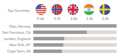
Metrics with longer label names should be shown as a horizontal bar chart to allow the full label to be displayed. This will also let you show 20 or 25 different sources in a clean way. Impressions by location is a simple way to understand how you're increasing brand awareness in different geographies.
MARKETING KPI: MARKETING QUALIFIED LEADS
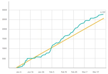
Using the demand generation waterfall, the digital marketing team needs to keep a close eye on every stage of the sales cycle, from raw inquiries to bookings. The best way to do it is with a relative line graph. The orange line is the goal and the blue line is the actual performance. If blue is above orange, you’re doing well. If not, you’ve got some work to do.
MARKETING KPI: CONVERSION RATES
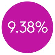
Sometimes you have a single metric that needs to be reported as if it’s a data set. Here we have the conversion rate for sales accepted leads to deals won. The best practice for such data is to use a pie chart with a lone piece of the pie. Some digital marketing teams only focus on measuring how many leads they're putting the top of the funnel when in reality conversion rate has the biggest impact on the KPIs your board is most interested in.- revenue.
MARKETING KPI: ORGANIC TRAFFIC
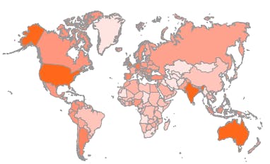
SEO goals can include the amount of traffic coming to landing pages hosted on your website from specific countries that you’ve been focusing on. One way to show this information is with a heat map. The scale is dark red (most visitors) to dark green (least visitors), with gray in the middle. If your KPI is to grow international presence, this metric, which can also be found in Google Analytics is particularly insightful.
MARKETING KPI: CHURN
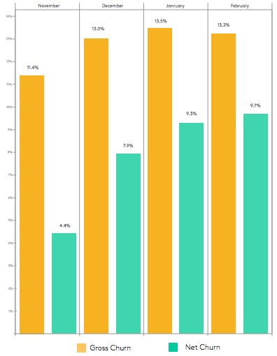
When tracking two similar KPIs together, like gross churn and net churn, you can use a comparative bar chart. This shows the relative performance of multiple metrics over a given period of time. Social media plays an important role in client retention strategies, so think about how you can pair this information with churn data.
MARKETING KPI: NET PROMOTER SCORE
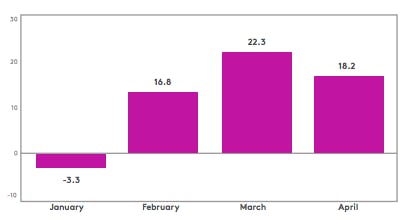
Are some of your KPIs dealing with negative numbers? Bar charts can be positive, negative, or both. This chart is trending in the right direction. NPS measures client happiness and is a common metric used across all industries.
These are just a few examples of how data visualizations might look if you use Tableau or Meltwater for reporting on key performance indicators. Tools like Meltwater’s media intelligence platform already include data visualizations (such as graphs, heat maps, and word clouds) for you and can be easily exported as ROI reports. Whether you decide to consolidate your data on Tableau, the report from each tool individually, or even just stick with Excel, pretty graphs make reports more palatable for the team at large, especially your execs. The more they focus on the charts, the more they focus on the data behind the charts—and appreciate your contribution to the business as a whole.
You may have a data geek who can pull these reports on a daily, weekly, or monthly basis, but each team member should own their report and know where they are with regard to their goals and the ROI they are generating. Armed with this data, they can make informed decisions to help set goals, surpass them, grow the company, and prove the department’s worth. Taking a data-driven approach can also increase your chances of gaining more PR, social media, marketing, etc budget. By showing the ROI that you bring in, the activities you're paying for a look more like an investment than a cost.
Hopefully, now you and your team of marketing executives have a better understanding of which KPIs to focus on, as well as the type of reports best used to showcase them.


Comments
Post a Comment